
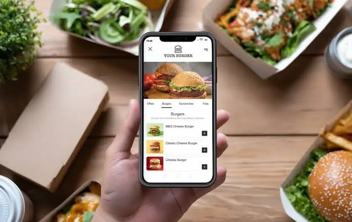

A food menu connects customer interest with a final order. It explains what a business serves, how much each item costs, and which choices fit a customer’s needs. A clear menu can shorten decision time, reduce staff questions, and support accurate orders.
Small delays can create a large service problem. If 200 customers need one extra minute to understand a menu, the business absorbs more than three hours of added decision time in one day. Better menu structure can recover part of that time without rushing customers.
A useful menu puts people first. Customers need familiar categories, honest descriptions, readable prices, and accurate dietary information. These needs should guide every design and content decision.
Define What Customers Need From the Menu
Many food businesses create menus by listing every available dish and arranging the items according to internal kitchen systems. The list may be accurate, but it may not match the way customers think. A kitchen may group food by equipment or preparation station, while a customer thinks about appetite, budget, ingredients, and dietary needs.
For example, a customer may want a light plant-based lunch under a fixed price. If suitable dishes appear across starters, sides, specials, and grilled items, the customer must search through the entire menu. The right food exists, but the structure hides it.
Your business can start with a clear purpose statement. A useful statement might be, “This menu should help a first-time customer find a complete meal within two minutes.” Another might be, “This menu should help customers compare family portions without asking staff for basic details.”
This step works because it gives the menu a measurable job. Each category, image, and description can support that job. Information that does not help the main task can move to a secondary section.
Staff feedback can make the purpose more specific. Your team can record common questions during several service periods. Questions about portion sizes, ingredients, and meal contents reveal gaps that the menu can address.
Give Customers Simple Access to Current Information
Printed menus can become inaccurate after a price change, recipe update, or stock issue. Temporary corrections may create clutter, while verbal updates place extra pressure on employees. Customers can also feel disappointed when they select an item that is no longer available.
A well-organized QR Menu can give customers direct access to current dishes, prices, ingredients, and dietary notes. Staff can update one source when an item sells out or a special becomes available. Customers then receive more accurate information before they order.
Consider a café that serves two rotating soups each day. A printed menu may list six possible soups and require staff to explain the current choices. A digital menu can display only the two available options and remove one as soon as the final portion sells.
Access should remain simple. The code should open the menu directly without requiring an application, account, or personal information. Each additional step increases the chance that a customer will leave the page or ask for another menu.
Code placement also affects use. A small code on a crowded sign can be hard to scan. Strong contrast, enough empty space, and a short label such as “View the current menu” can improve access.
A printed menu should remain available for customers who cannot or prefer not to use a phone. This option supports a human-first service model. Technology should expand access instead of creating a new barrier.
Arrange Categories Around Customer Intent
Long menus often make customers work harder than necessary. A list may contain starters, individual dishes, meal combinations, side portions, sauces, drinks, and desserts without a clear visual order. Customers must inspect several sections before they understand how to build a complete meal.
Category names can also create confusion. Labels such as “Kitchen Favorites” or “House Choices” may sound appealing, but they do not explain whether the section contains main dishes, snacks, or shared plates. Clear labels usually provide more value than creative but vague wording.
Your menu can use familiar categories such as:
- Breakfast
- Starters
- Main dishes
- Plant-based meals
- Children’s meals
- Sides
- Desserts
- Drinks
The exact categories should reflect the food and service format. A small lunch venue may need only sandwiches, bowls, sides, and drinks. A large dinner menu may need separate sections for meat, seafood, pasta, and plant-based dishes.
Large sections can be divided into smaller groups. A main dish category with 25 options may become grilled dishes, lighter meals, plant-based meals, and shared plates. This structure works because customers can ignore groups that do not match their needs.
Popular complete meals should appear before optional extras. Sauces and upgrades can remain close to related dishes, but they should not block access to the primary choices.
Write Descriptions That Answer Practical Questions
A dish name often makes sense to the people who prepare it. A new customer does not have the same knowledge. Names such as “Garden Plate,” “House Bowl,” or “Special Sandwich” reveal little about ingredients, flavor, or portion style.
Weak descriptions create repeated questions. Customers may want to know whether a dish includes a side, whether a sauce is spicy, or how the main ingredient is cooked. Each unanswered question increases ordering time and raises the chance of a poor choice.
A practical description can include four elements:
- The main ingredient
- The cooking method
- The key sauce or flavor
- The included side or topping
“Chicken Bowl” offers limited guidance. “Grilled chicken with seasoned rice, roasted vegetables, and lemon herb sauce” gives the customer a clearer picture. The second version supports a decision because it explains the main contents in one sentence.
Specific words work better than unsupported praise. Terms such as “roasted,” “smoked,” “chilled,” “crispy,” and “garlic sauce” communicate useful facts. Words such as “perfect,” “famous,” and “amazing” express an opinion without explaining the food.
Your staff can track repeated questions about individual dishes. If several customers ask whether a meal includes fries, the description should answer that question. Real customer questions provide stronger guidance than assumptions.
Display Prices and Extras With Full Transparency
Customers lose trust when the final price differs from the amount that first attracted their attention. A dish may show a base price while common sides, sauces, and required selections add several charges. The information may be technically correct, but the customer still experiences an unpleasant surprise.
For example, a sandwich may appear at one price even though most customers add a side. A meal image may show a large drink while the listed price includes a small one. These details create expectations that the final order does not meet.
The menu should state what each base price includes. Required selections and optional additions need separate labels. Every choice that changes the total should show the added cost beside it.
A transparent entry could look like this:
- Grilled vegetable wrap with side salad: $12
- Add roasted potatoes: $3
- Add plant-based protein: $4
- Replace the salad with soup: $2
This format works because customers can estimate the total before ordering. It also helps staff confirm substitutions and additions without causing confusion.
Prices should use one consistent format. Small footnotes and distant upgrade charges make comparison harder. Clear placement supports trust and reduces payment disputes.
Present Dietary and Allergen Information Clearly
Dietary symbols can save space, but symbols do not always have a shared meaning. A leaf may represent vegetarian food, plant-based food, fresh ingredients, or local produce. Customers with allergies need direct information rather than visual hints.
Recipes can also change through substitutions. A different sauce, garnish, stock, or coating may introduce an allergen even when the dish name stays the same. The public menu must reflect the food that the kitchen currently serves.
Plain labels such as “vegetarian,” “plant-based,” “contains dairy,” and “contains nuts” reduce uncertainty. If your menu uses icons, a visible key should explain every icon.
An internal ingredient record can support accurate public information. The record can include the full recipe, packaged components, sauces, garnishes, and approved substitutions. A manager or chef can review the menu whenever an ingredient changes.
Cross-contact requires separate language. A dish may contain no gluten ingredients but share equipment with food that contains gluten. The menu should avoid making a guarantee that the kitchen cannot support.
Clear information works because it helps customers ask focused questions. The menu supports the decision, while trained employees provide personal guidance for serious allergies.
Use Food Images to Clarify the Offer
Food photography can help customers understand unfamiliar dishes and portion sizes. It can also create false expectations when the image includes extras that the listed price does not cover. Differences in camera angle can make one portion appear larger than another.
A crowded digital menu may also load slowly when every item has a large image. Customers on older phones or weaker connections may wait for photographs before they can read basic details. Visual content then becomes a barrier.
Images work best for signature dishes, unfamiliar foods, meal combinations, and family portions. Familiar drinks, basic sides, and simple sauces may not need photographs.
Each image should match the current recipe and serving size. If an extra item appears in the photograph, the caption should explain that it is optional. A consistent camera angle, background, and crop will make comparisons more reliable.
Compressed image files can improve loading speed. The menu should also be tested through a mobile connection rather than fast workplace internet. This test works because it reflects the conditions that many customers experience.
Test the Menu With Real Ordering Tasks
Menu creators already know the dishes, so they can move through the menu without noticing unclear labels. First-time customers do not have this advantage. They may pause at an unfamiliar category or miss a charge that appears obvious to staff.
A useful test gives each participant a specific task. One person might find a vegetarian lunch under a fixed budget. Another might choose a family meal and calculate the price after adding two sides. A third might look for a dessert that contains no nuts.
The team can record:
- Time needed to complete each task
- Questions asked by each participant
- Categories that caused hesitation
- Prices that participants misunderstood
- Items that were difficult to find
- Differences between print and phone use
Participants should include people who did not create the menu. First-time visitors, older adults, and customers with limited vision can reveal issues that regular staff members miss.
Observed behavior gives the business practical evidence. If several participants pause at the same category, that label needs revision. If customers miss an upgrade charge, its placement needs attention.
Review Results and Improve One Issue at a Time
A menu can become outdated as prices, recipes, and customer habits change. However, changing categories, descriptions, images, and prices at the same time makes results difficult to measure. The team cannot tell which adjustment improved or harmed the experience.
A focused review can use a small group of service measures. Useful examples include ordering time, repeated questions, order corrections, requests for printed menus, and reports of digital access problems.
The business can choose one clear issue each month. It might rewrite five unclear descriptions, simplify one large category, or improve the display of optional charges. Staff can then observe the result before making another change.
This method works because each update connects to a known customer problem. It also gives employees time to understand the revised menu.
The final standard should remain human first. A strong food menu helps real people understand their choices, compare prices, and order with confidence. Clear structure and current information support that goal, while technology remains a practical tool rather than the center of the experience.